As most kids born in the 90s I was very influenced by skateboarding and was a "skater" myself. I always loved skateboard art and I remember going with my friends to skate shops to see the shapes from brands like Santa Cruz, Flip, Powell Peralta and others. I must admit that this art had a huge influence on my work and here's just a little tutorial in tribute to that.
Warm ups
If you're not really into skateboard art, I would suggest you to take a look at
Jim Phillips artworks, he's like the father of skateboard art. Besides Jim, you should also check guy like
Billy Argel, Gunsho, Pablo Etchepare and Diego Medina, whose work is intricately linked with the skateboard culture.
Ok, enough talking, so what are we going to do today? Quite simple: A "Cool" in melting green-ish letters, old school style.
Let's begin with some warm ups, as you may already know, pointilism can be really tiresome and messy, so let's make some simple exercises. Make a circle, a triangle and a square, start filling it with dots doing the following movements: circular for the ellipse, triangular for the triangle and side to side for square. That way you will be warming up your wrist and also testing your dot control, try it at least two to three times If you never tried this technique before. Do it slowly and don't put too much pressure or you may get your wrist injured because of the repetition. This technique will be used on the following in order to give some depth on the letters.
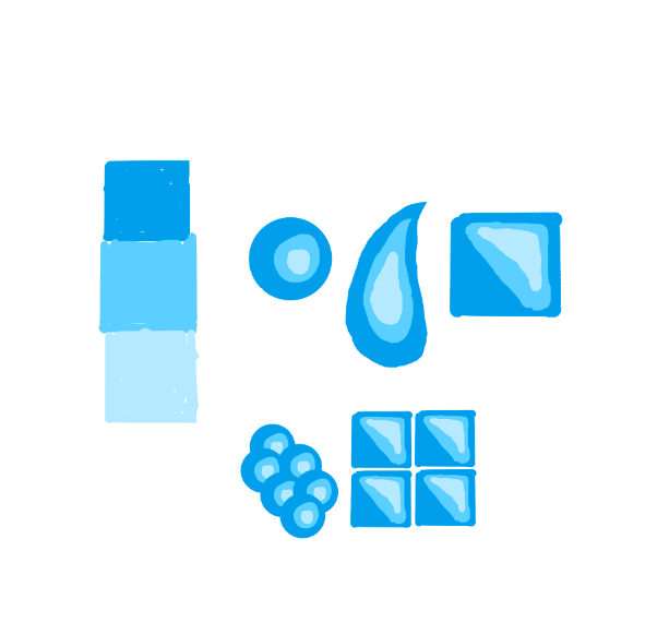
You probably already know hard gradients are, nowadays they are mostly used on vector art and t-shirt art, as some printing methods require few colors. If you've never used before, try this simple exercise: make a three color gradation, like the blue one I did, then try drawing some forms with the darker color, make a reflex with the medium color and a little reflex with the brighter. As you can see, from a certain distance your eye will assimilate a gradient. Try as many forms as you want, then make patterns to see the effect they have on the illustrations. This technique will help later on giving depth to the letters.